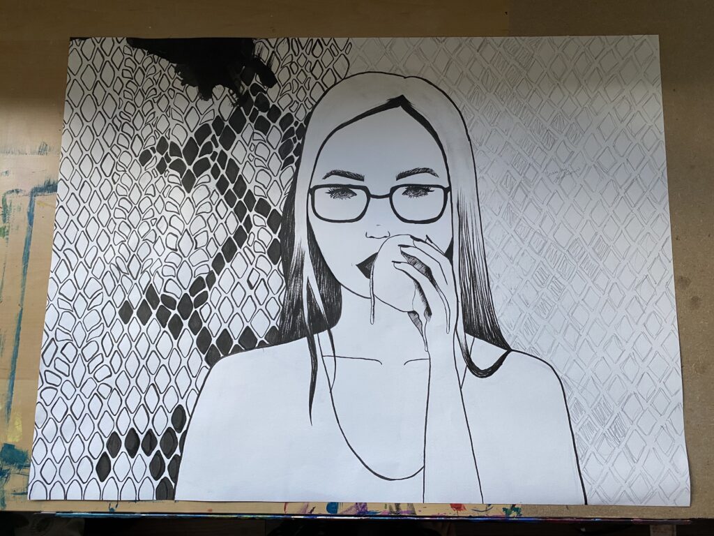
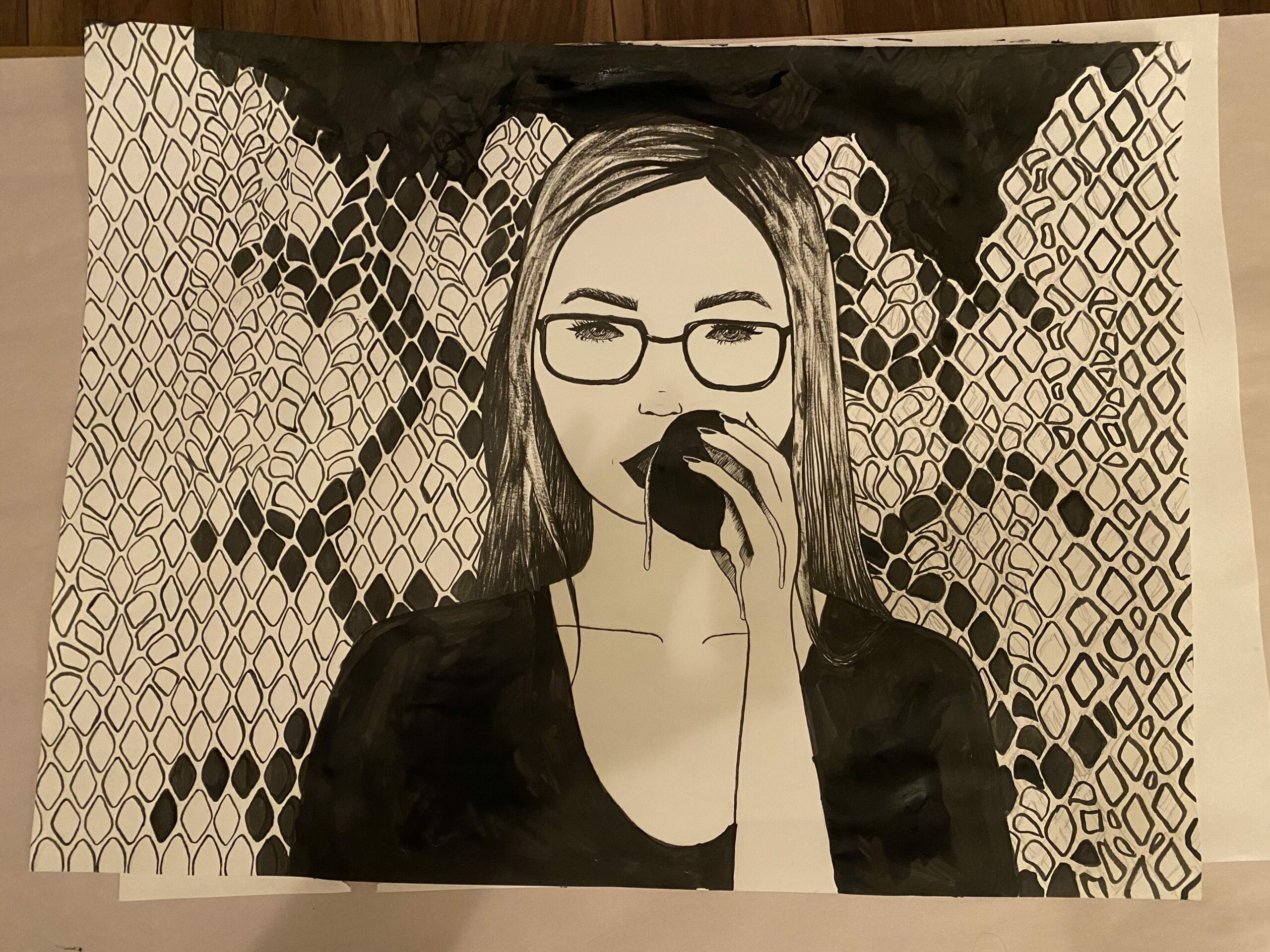
I bit the apple ‘cuz I loved you (and why would you lie?) 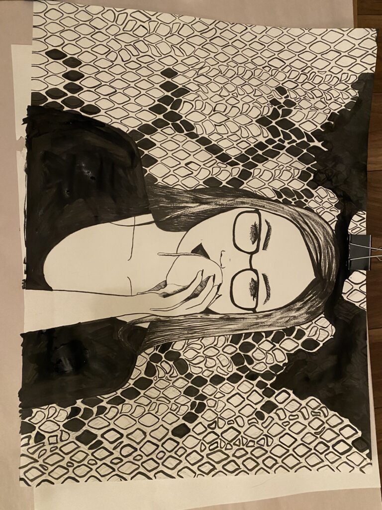
The title is based on a song lyric from the song Rat by Penelope Scott, which is a reference to the story of Adam and Eve. The background is meant to resemble snakeskin; another reference to the biblical story. Though I’m not a particularly religious person, I find the stories of the Bible fascinating and thought it would be an interesting narrative to portray through this piece. I wanted to take a bit of a darker spin on the story, hence the blood dripping from the apple.
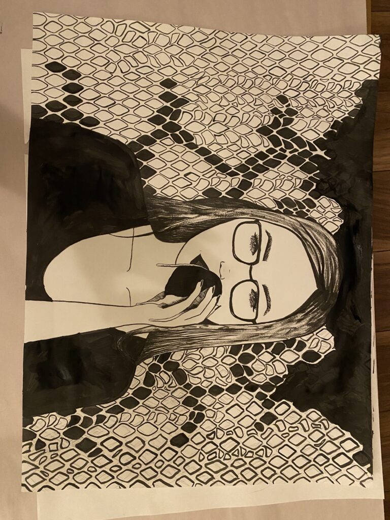
When I was first starting this I was in a digital art class at school. At the time, I hadn’t really learned how to properly proportion a face aside from what I knew from observation. I’m still not good at consistent spacing and proportions of the face, but I think if I could redo this drawing now, the face would look very different. The eyes would be closer together and bigger, and the nose would be bigger too. I’ve had a bad habit in the past of making the features too big on a face, so I was consciously trying not to do that this time and I just went too far.
The subject is my friend Brooke, whom we always joke is going to become a nun (she’s not religious), so I thought it’d be a little funny to portray her as Eve.
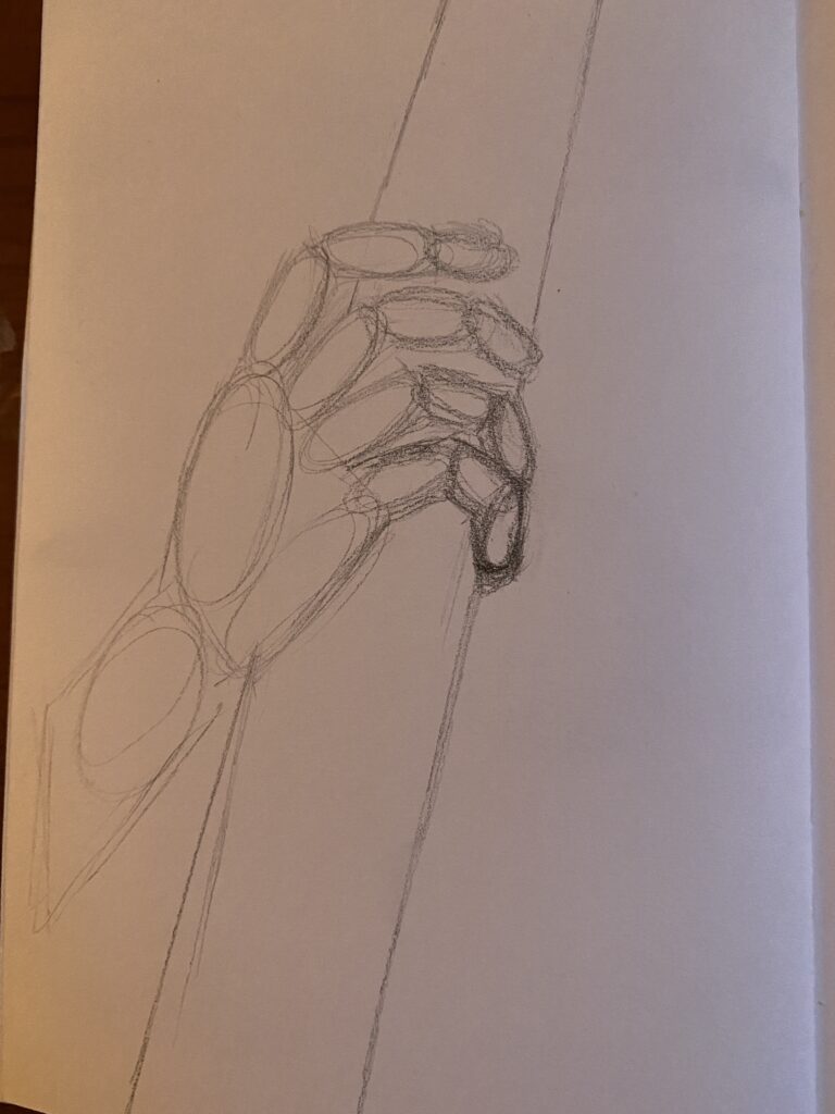
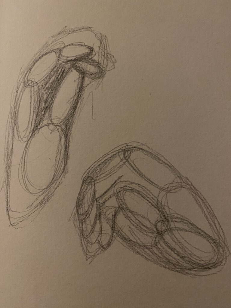
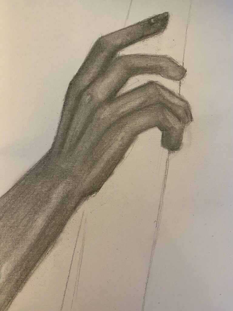
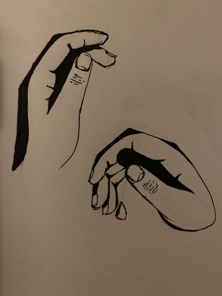
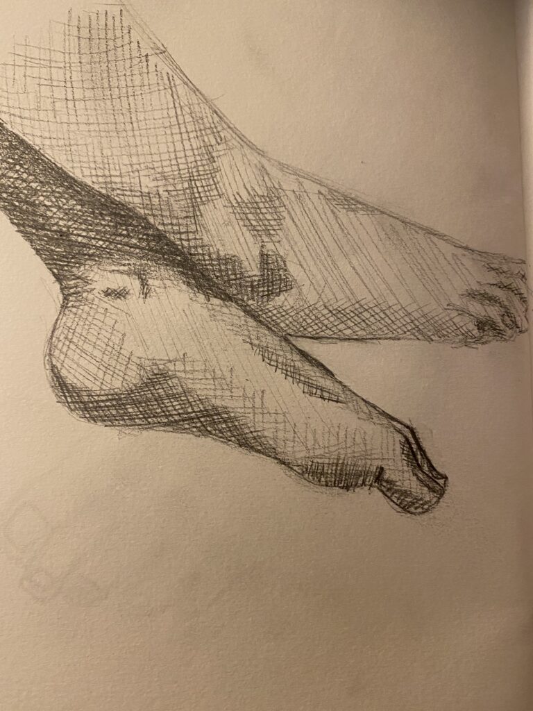
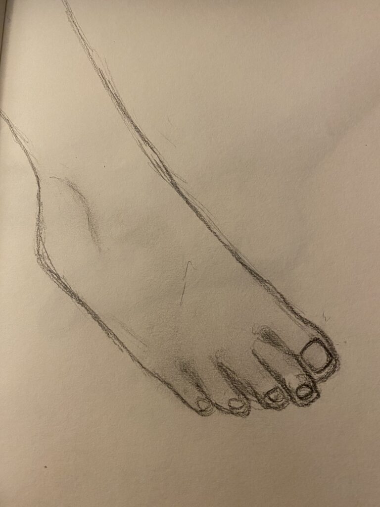
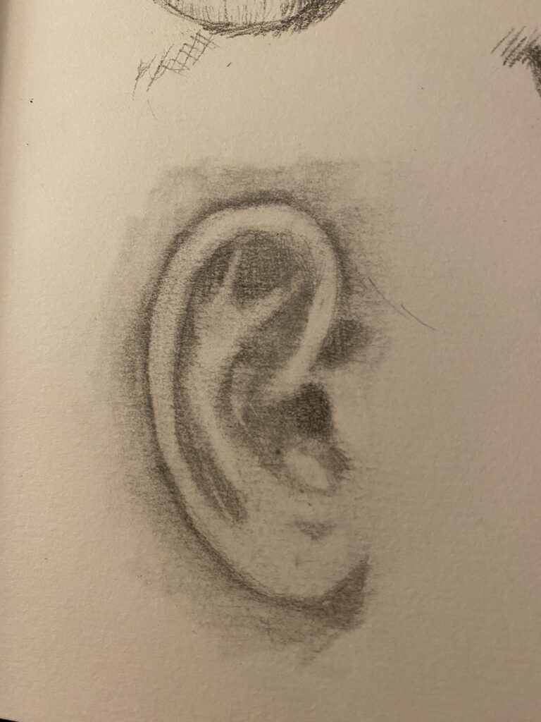
Hand and feet studies:
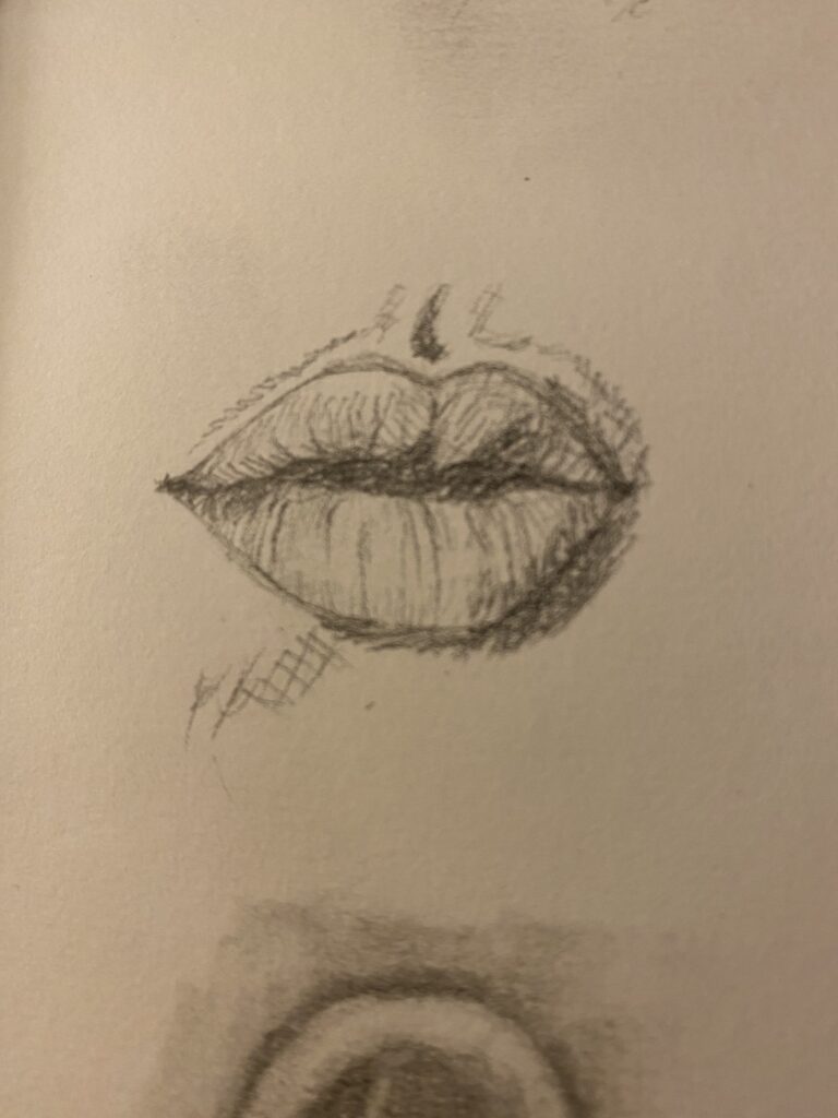
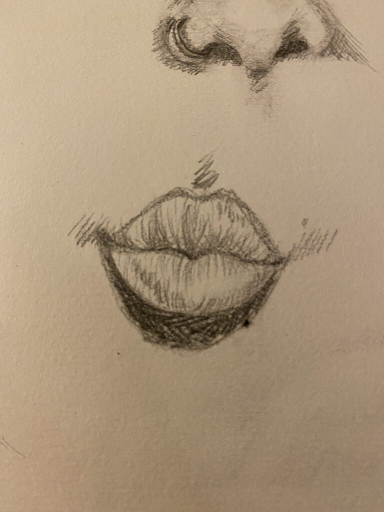
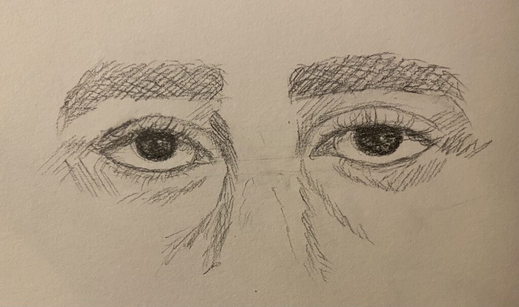
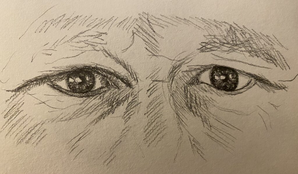
Facial feature studies:
Artist Research 2
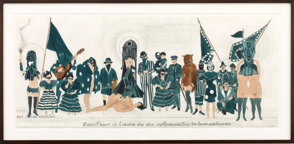
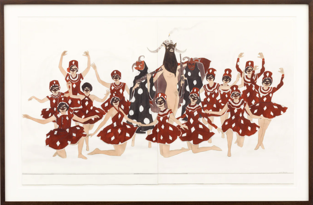
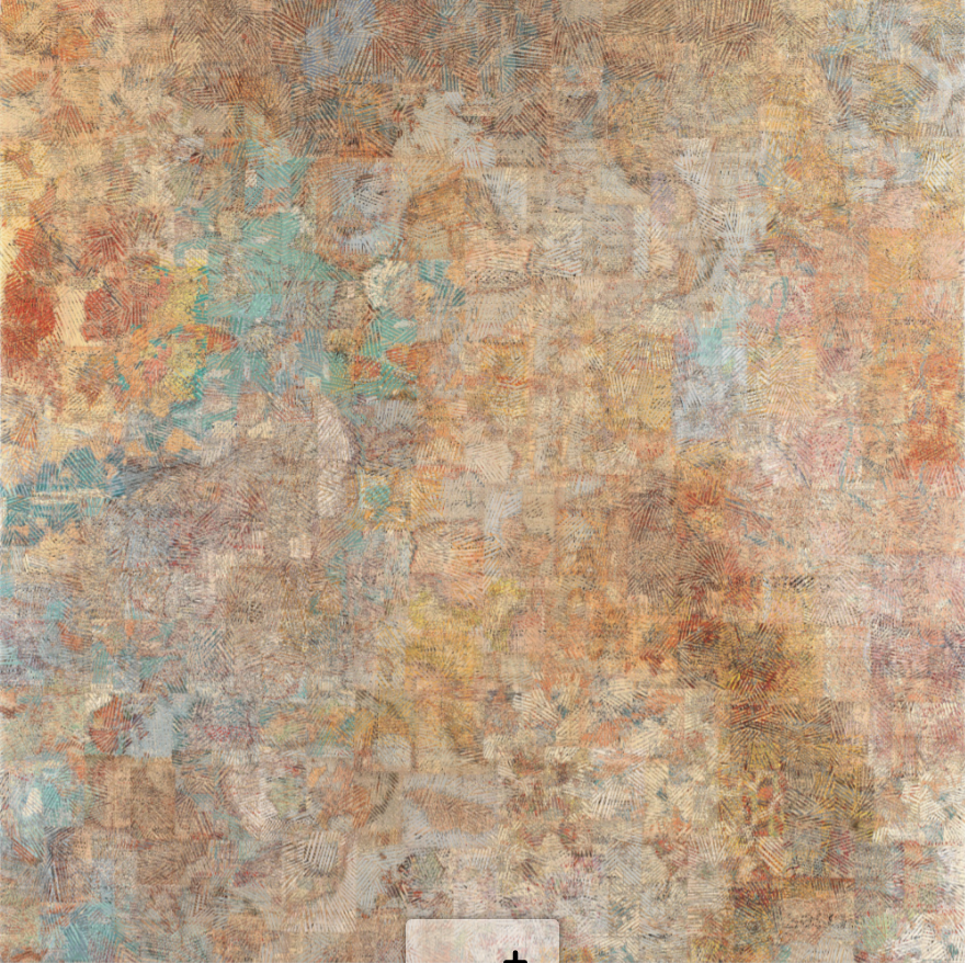
Marcel Dzama
Marcel Dzama’s work is mainly colourful illustrations and black and white cinematography. Dzama has used watercolours, various sculpting materials, as well as unique photographical and film perspectives. He uses a lot of strange and sharp shapes and lines in his illustrations and his sculpture. In his paintings, the watercolours create a stark difference in texture to the black ink used to accentuate the shapes.
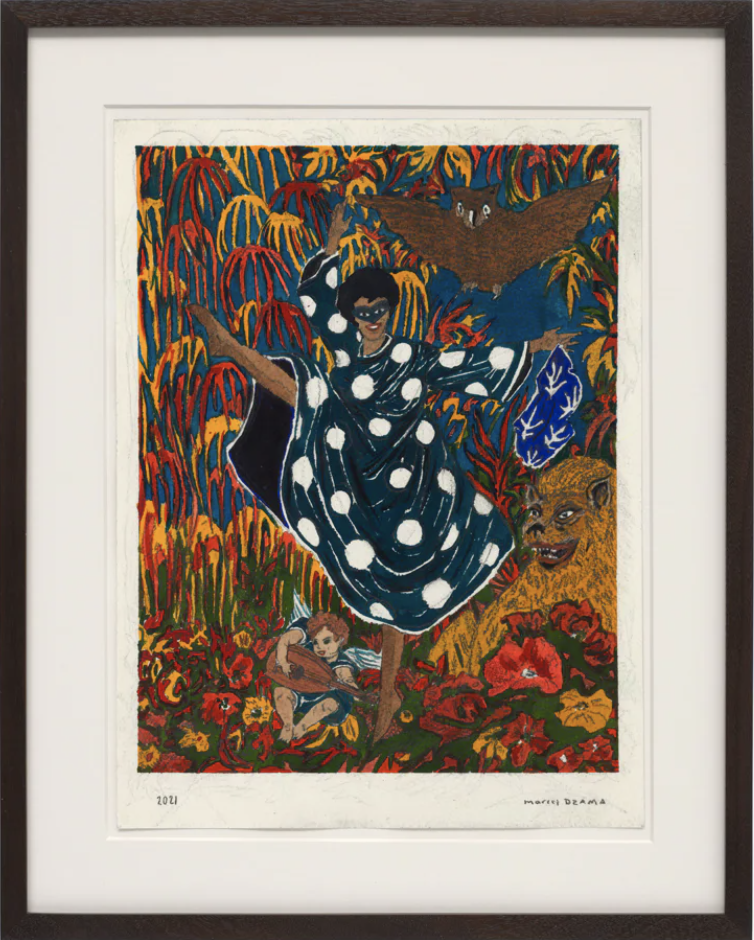
1. How is the work made?
o What is the medium? What other materials or tools are used to make the work? How large is the work?
This piece is watercolour, gouache and graphite on paper. A consistency in Dzama’s work is that with his paintings similar to this one, he sticks to a very small colour palette. Specifically in clothing, where he makes them all the same hue. This work is 21 1/8 x 32 1/8 inches.
2. What are the formal elements of the artwork?
o What are the formal elements used in the making of the artwork? (line, shape, texture, form)
o How are they organized in the composition? Describe the dominant principle used in the composition?
Dzama has a very unique and recognizable style, which includes strong colours, repeating shapes, and subtle symmetry in forms.
3. What is the context of the work?
o When was the work made? Where was the work made? Does the work relate to the social or political history of the time?
This piece was made in 2014, but there’s no artist statement of what it’s about. Considering it is called The flowers have horns and devil has thorns, it may be referencing any religious context (such as the devil and morality), news of the year (such as the pro-democracy protests in Hong Kong or the Ebola outbreak).
4. Describe the content/subject of the work. (What the artist says about the work)
o What is it about? What is happening? What message does the work communicate? Is it a part of an ongoing theme for the artist?
There’s no artist statement, so it’s hard to say what Dzama was thinking while he painted this piece, or even what exactly it’s about. In the painting, a group of women (possibly dancers) are posed around three figures in the center, the tallest of which can be assumed to represent the Devil. Perhaps it is a commentary on how we percieve the Devil and the moral questions that come into play when discussing religion.
5. What is the mood of the work? (What you say/feel about the work)
o What is the mood of the work? Has the artist created a certain atmosphere or feeling in the way the materials are used or elements are organized? How does the work make you feel?
I quite like this piece, however, after looking at a bunch of his other work, I must say that a lot of it makes me a little squirmy. There’s something off-putting about the way he uses shapes and stark contrasts especially in his photography and film that is really kind of scary to me. I suppose it’s supposed to create uneasiness in the viewer for a reason. Even in the piece I chose to focus on, you can see that the dancers are almost symmetrically placed on either side of the devil, but there are more dancer on one side. If this was purposeful or not, it creates an added unease in the painting. Humans crave order, and even a slight adjustment to that near symmetry is enough to make the work more eye-catching and thought-provoking.
6. How might their work inspire/influence your own studio practice?
I really like his use of gouache and watercolour and ink together. I’ve never tried it before, as I usually separate my pieces by material and don’t often mix mediums like that. I also really like the uniformity of the colours and then the contrast of the forms across the page. It’s a very interesting idea and concept, and I might like to explore that in my own work.
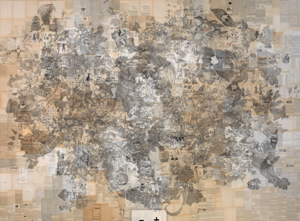
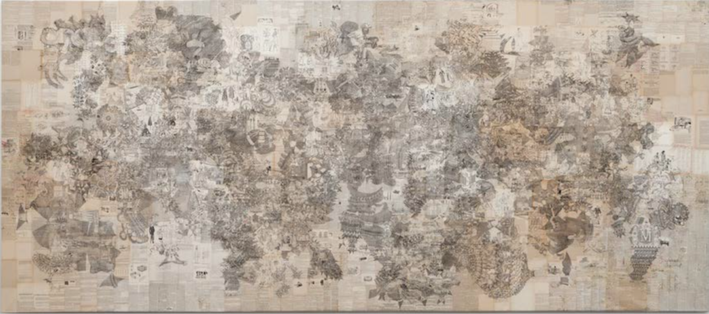
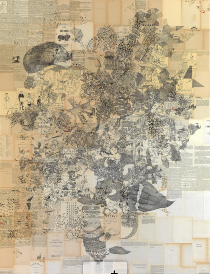
Antonis Donef
Antonis Donef’s work is mainly ink on paper mounted on canvas. The paper is reused pages from books, which creates a very interesting backdrop to begin with. Then, he goes in with inks of various colours (some pieces are exclusively black ink) and draws a dizzying amount of small drawings within the confines of the canvas which together, create a very engaging piece.

1. How is the work made?
o What is the medium? What other materials or tools are used to make the work? How large is the work?
Donef uses pages of old books mounted on canvas as his background for his ink drawings. This drawing is 220 x 500 cm.
2. What are the formal elements of the artwork?
o What are the formal elements used in the making of the artwork? (line, shape, texture, form)
o How are they organized in the composition? Describe the dominant principle used in the composition?
This work includes varying examples of form and line over top of print, which together creates a very engaging texture for the eye to observe. This work in particular is arranged so that most of the shapes and forms are somewhat centered on the canvas.
3. What is the context of the work?
o When was the work made? Where was the work made? Does the work relate to the social or political history of the time?
Much of Donef’s work focuses on his exploration of knowledge and theories on learning, as well as exploring how art connects to knowledge. There’s no artist statement to go along with this specific piece, nor is it titled (not much of his work is titled), but it’d be safe to assume that most of his work follows these ideas.
4. Describe the content/subject of the work. (What the artist says about the work)
o What is it about? What is happening? What message does the work communicate? Is it a part of an ongoing theme for the artist?
Refer to previous answer. There’s really nit much I can say about it without going into opinion or assumption.
5. What is the mood of the work? (What you say/feel about the work)
o What is the mood of the work? Has the artist created a certain atmosphere or feeling in the way the materials are used or elements are organized? How does the work make you feel?
I really like some of Donef’s other work. This one is very nice too, but I prefer lots of colour personally. I like the process of drawing on top of a busier background than plain paper or canvas. It brings an extra interest to the work, and this is definetly something I’d consider exploring in my own work in the future.
6. How might their work inspire/influence your own studio practice?
I accidentally answered this in the previous question, sorry.