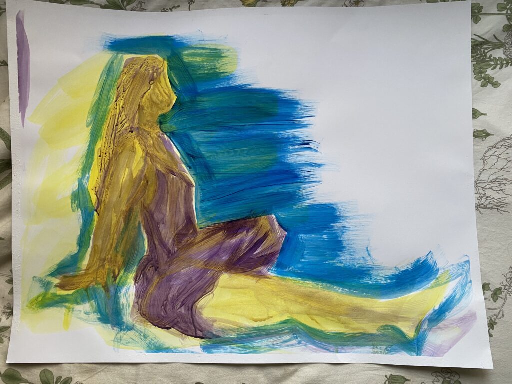
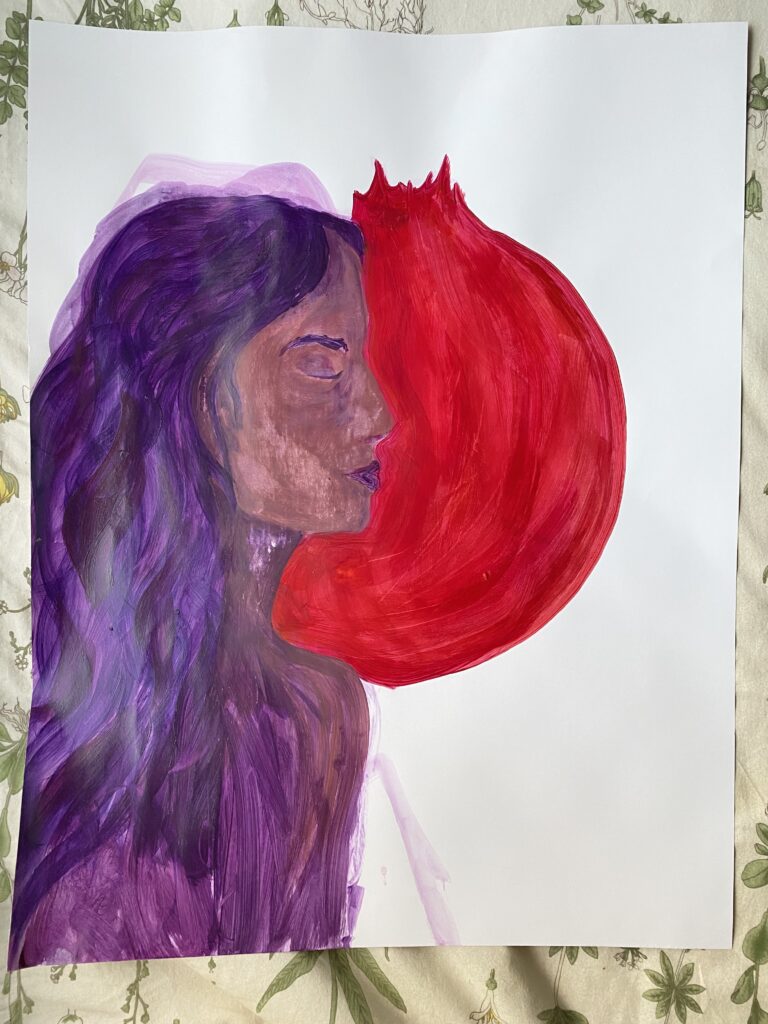
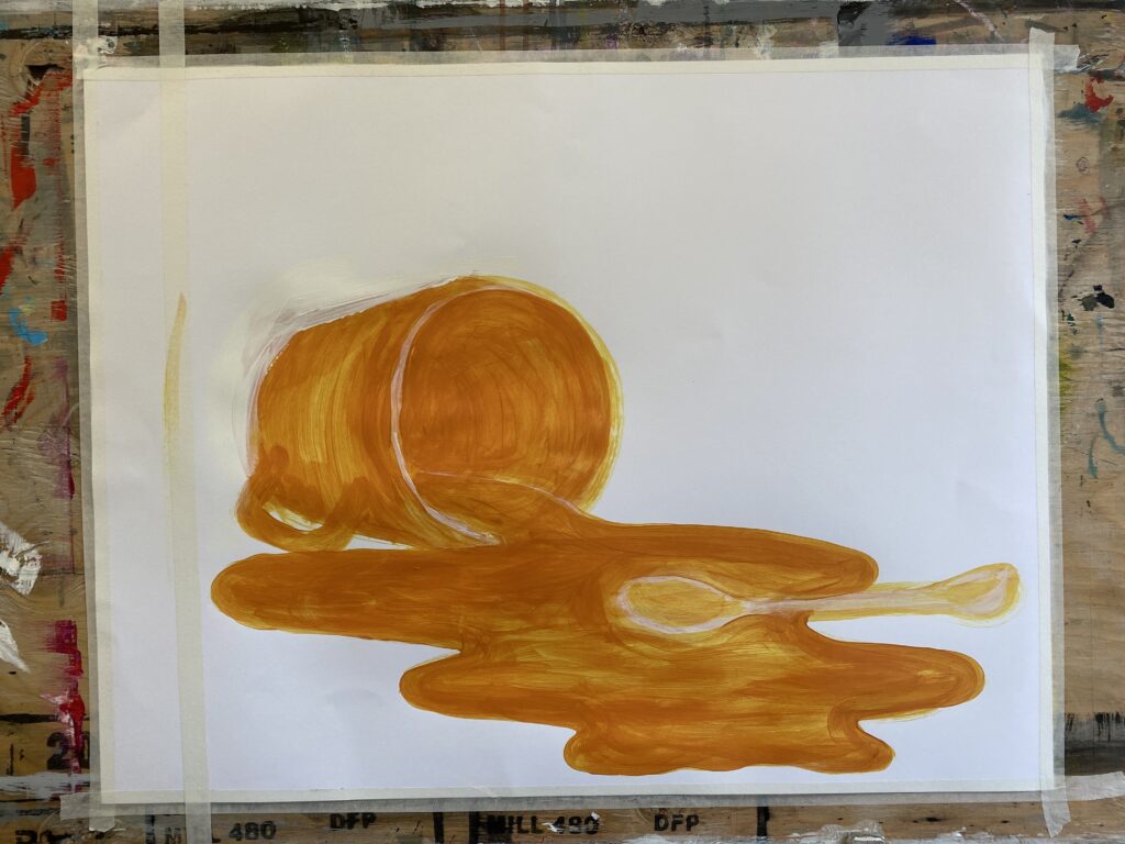
Colour
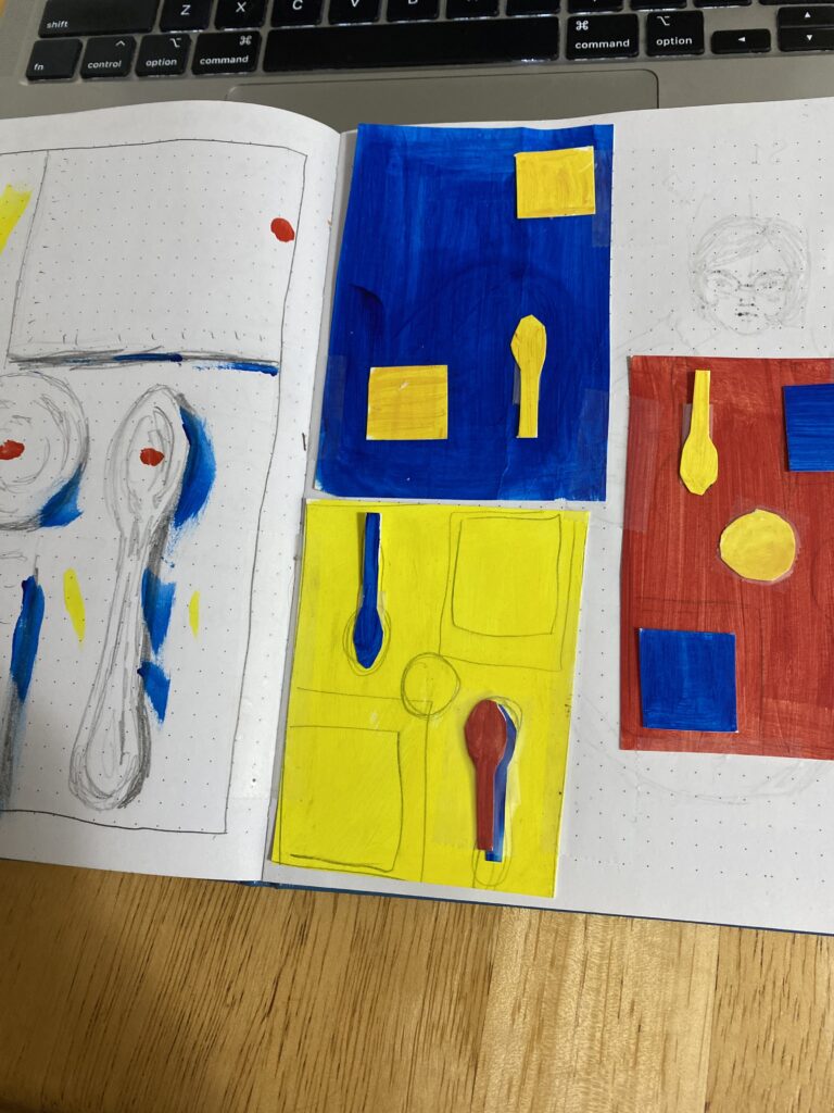
Studies for the primary painting.
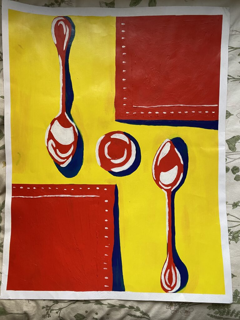
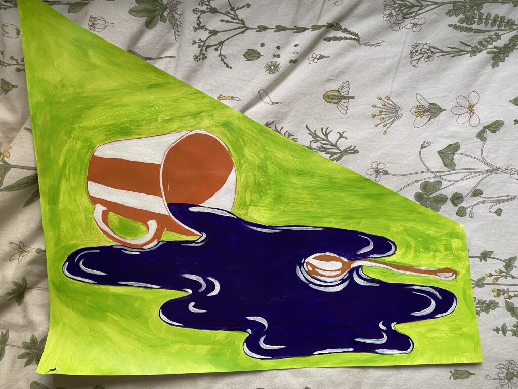
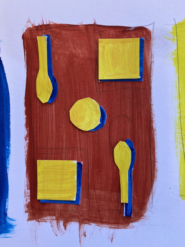
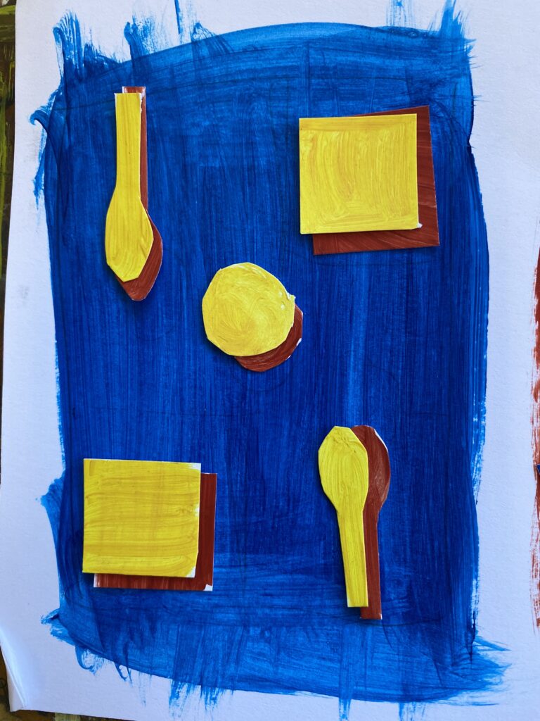
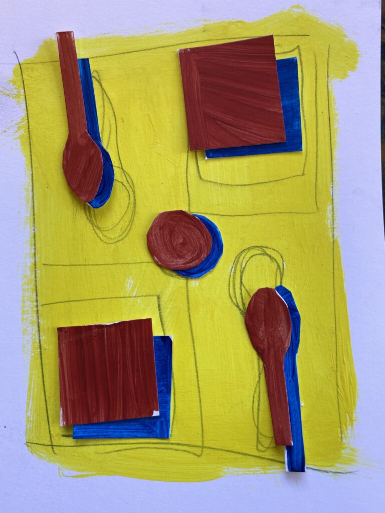
I painted rectangles of the possible background colours on paper and then painted little versions of my main objects in the piece. Then I cut them out and tried a variety of combinations. These were the three that I photographed, but I tried a few other variations as well. I wanted to stay within the criteria of the assignment while not compromising value and creating an interesting piece. Since red and blue are “darker” in terms of value, They usually worked best as shadows or base colours. But the yellow background offers a nice contrast, especially right against the blue.
I ended up going with the yellow-background composition, though it was a close call between that and the red background. I didn’t want to accidentally make a McDonald’s promo with the colours though, so the yellow background worked better.
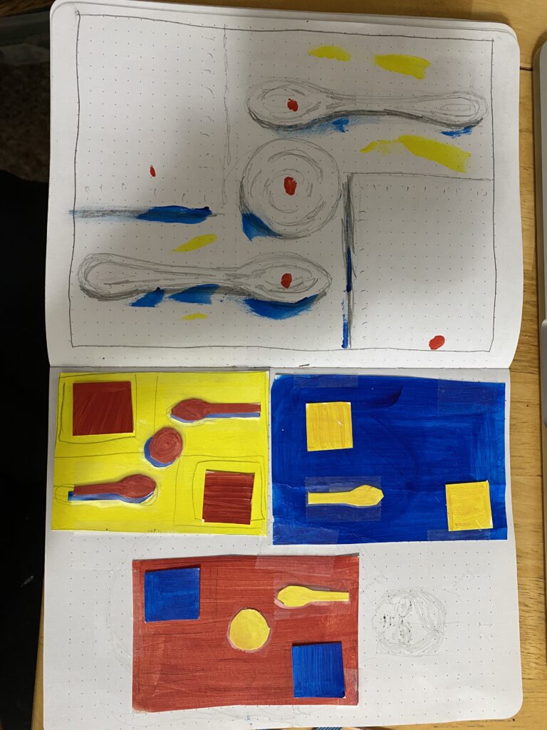
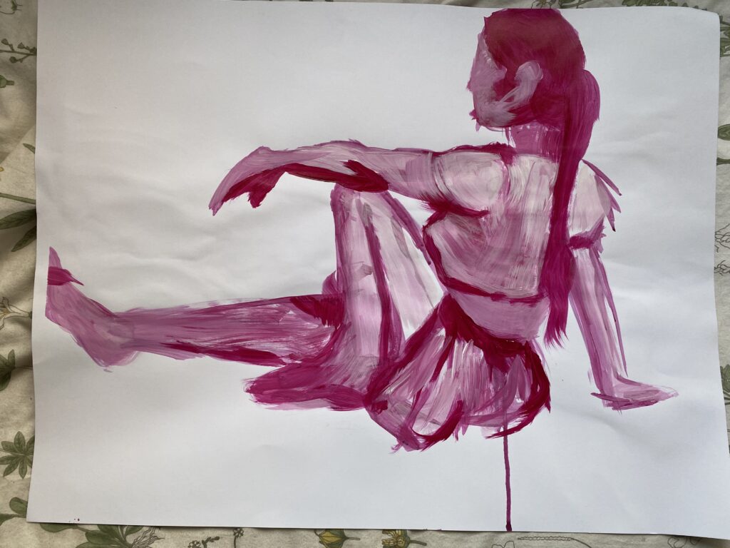
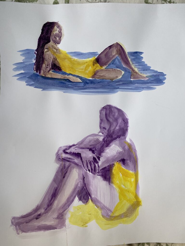
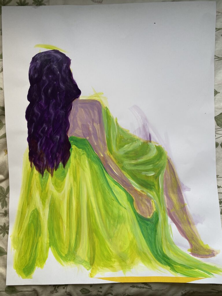
Model Studies
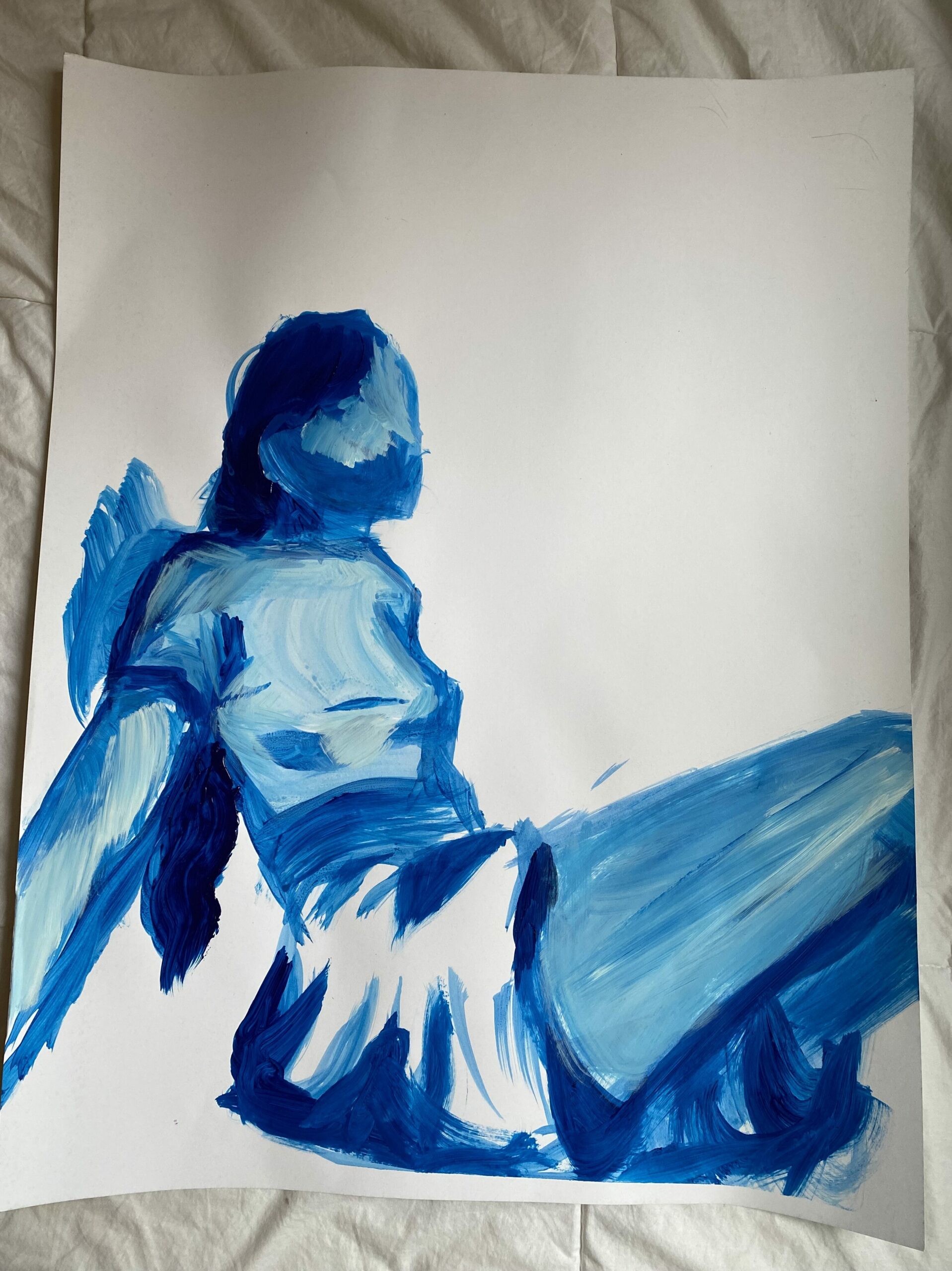
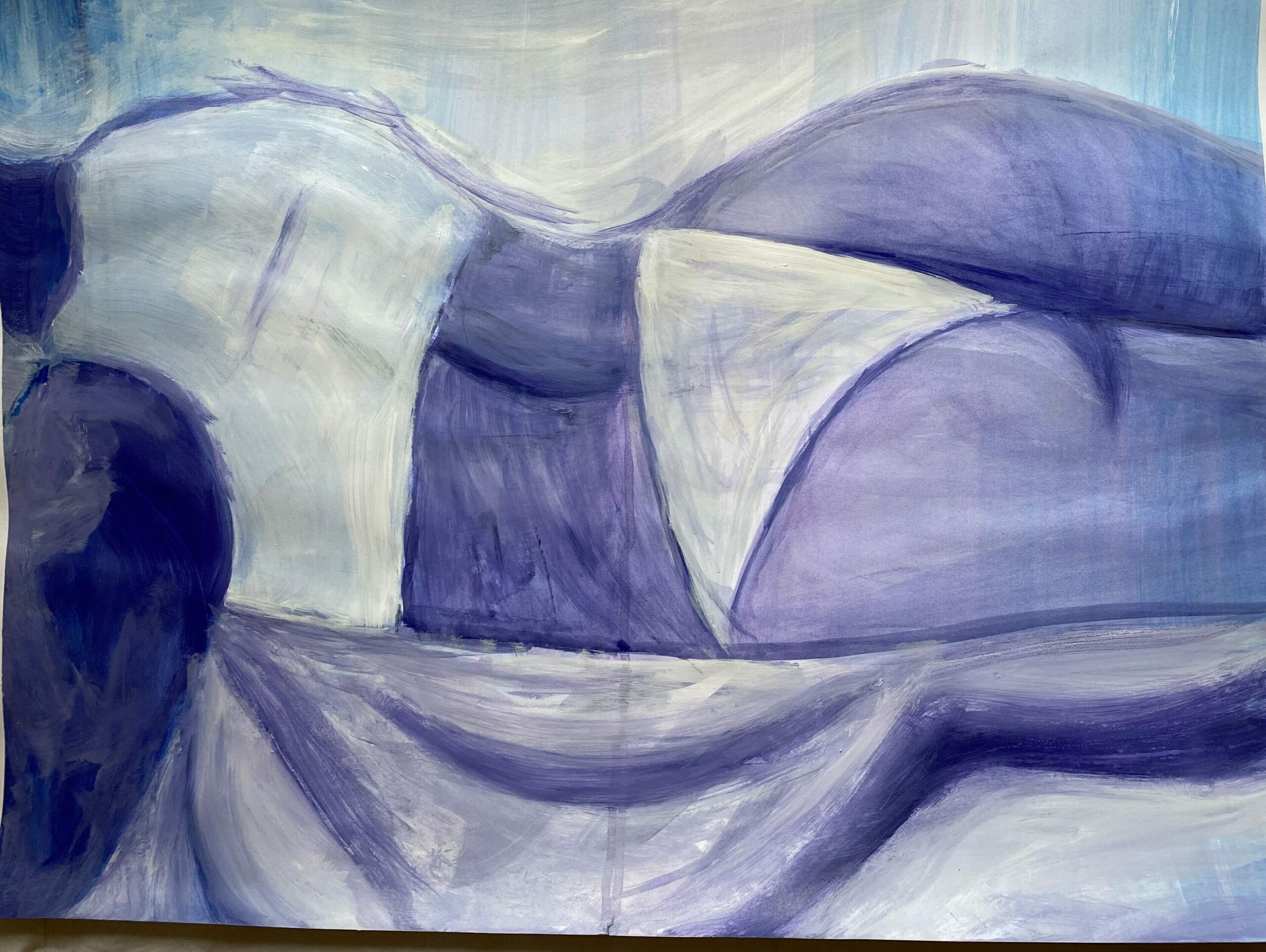
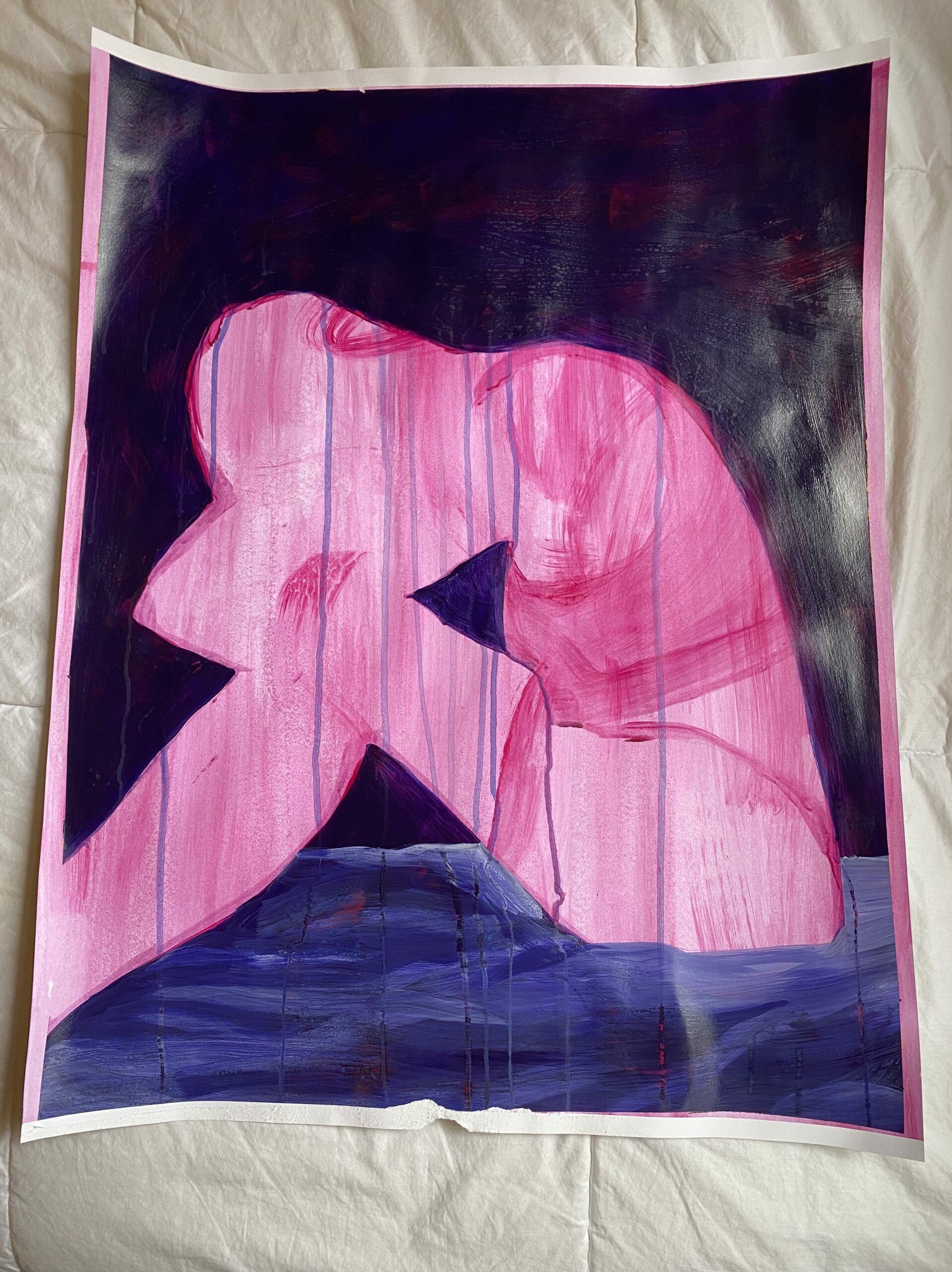
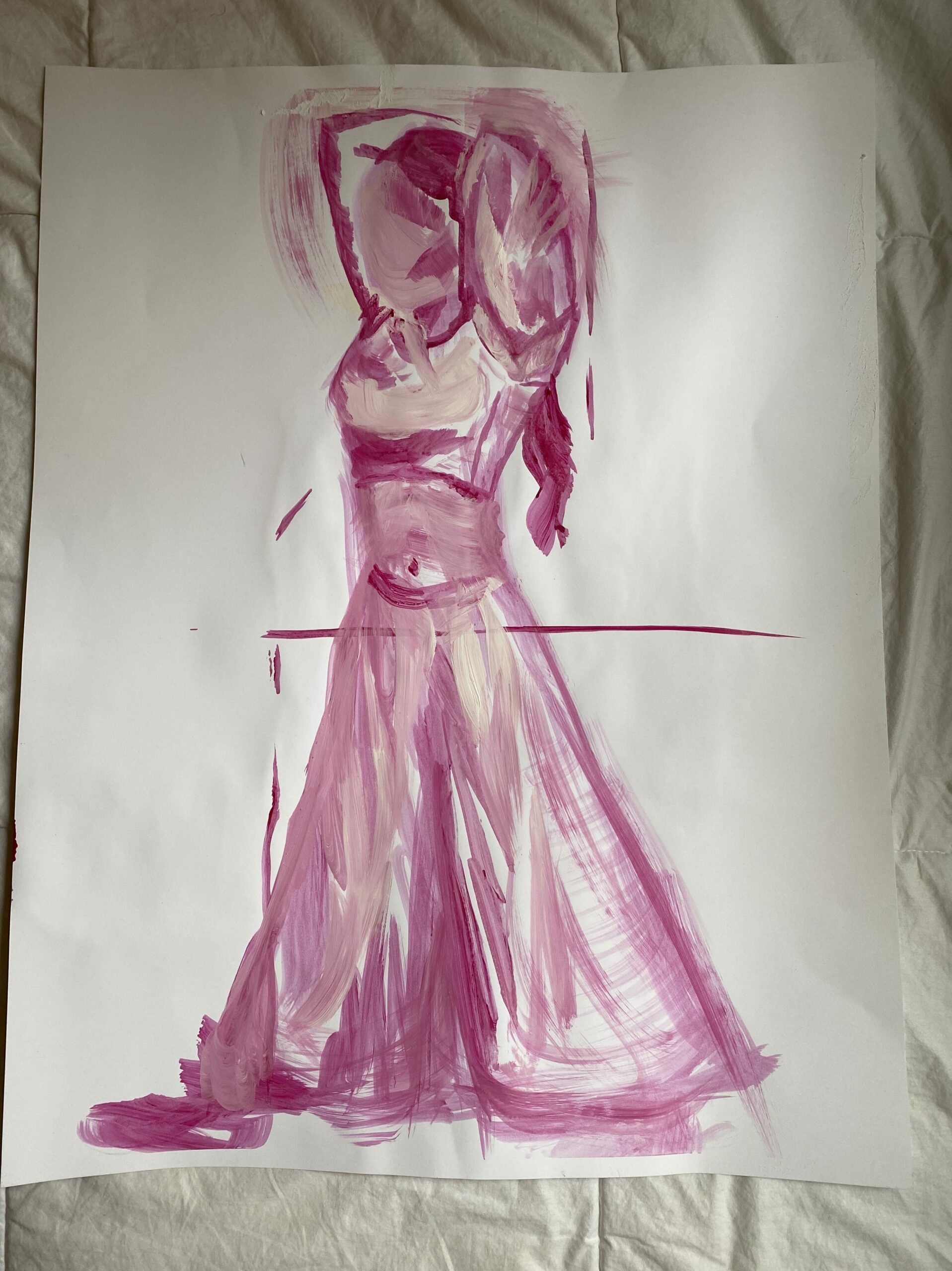
Figure studies from observation 🙂