Completely reimagining the project for the third time this semester whoops
What a huuuuge surprise.
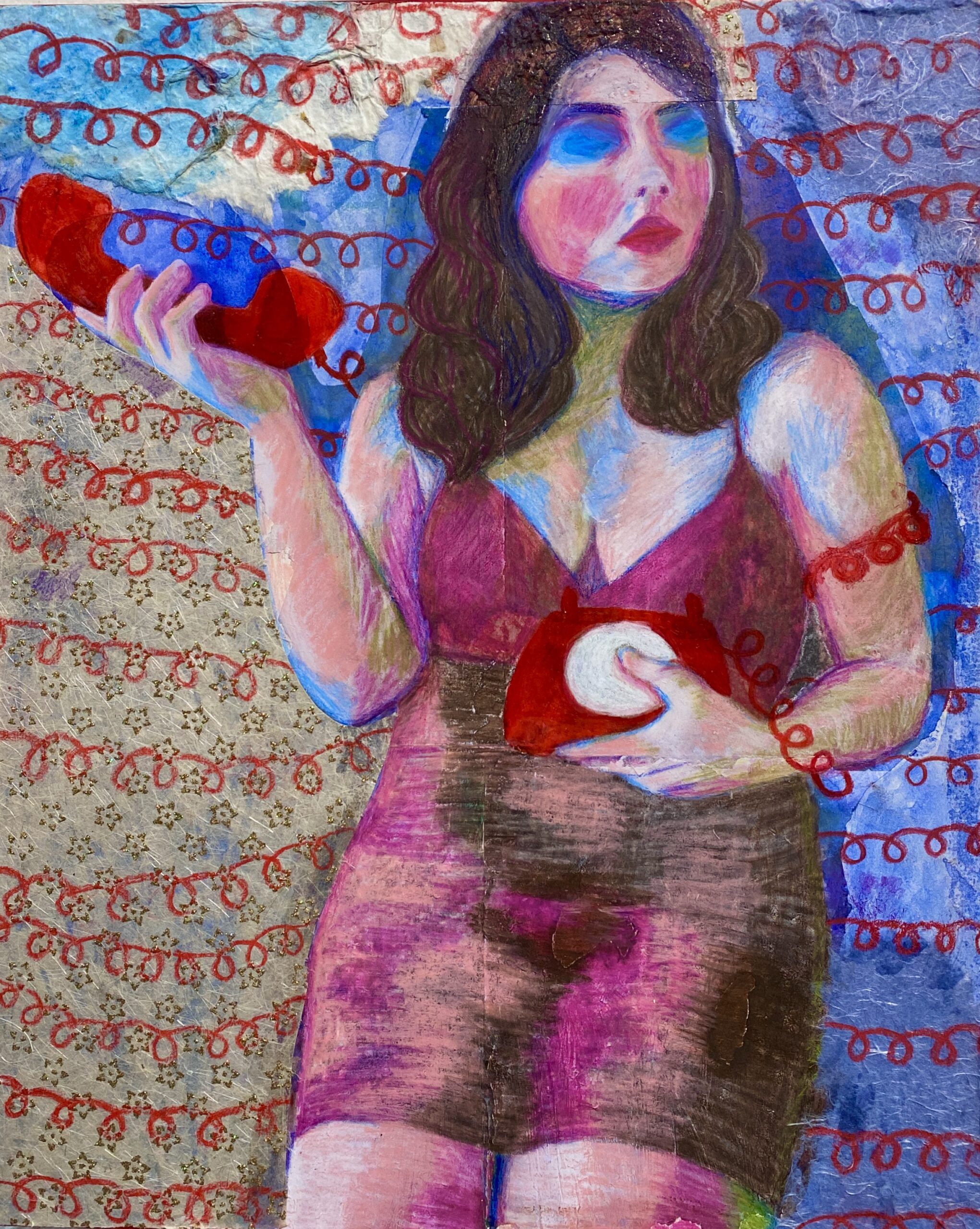
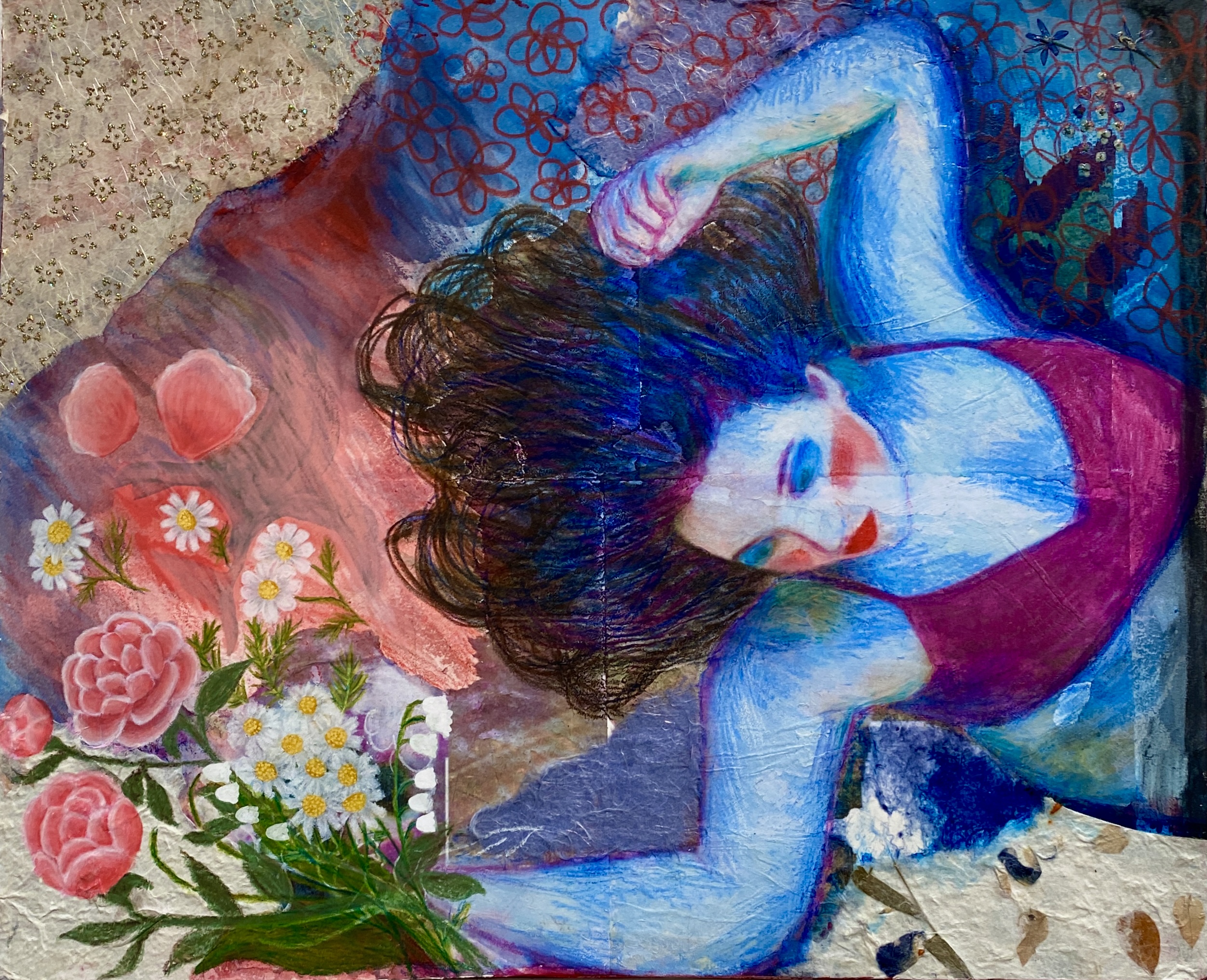
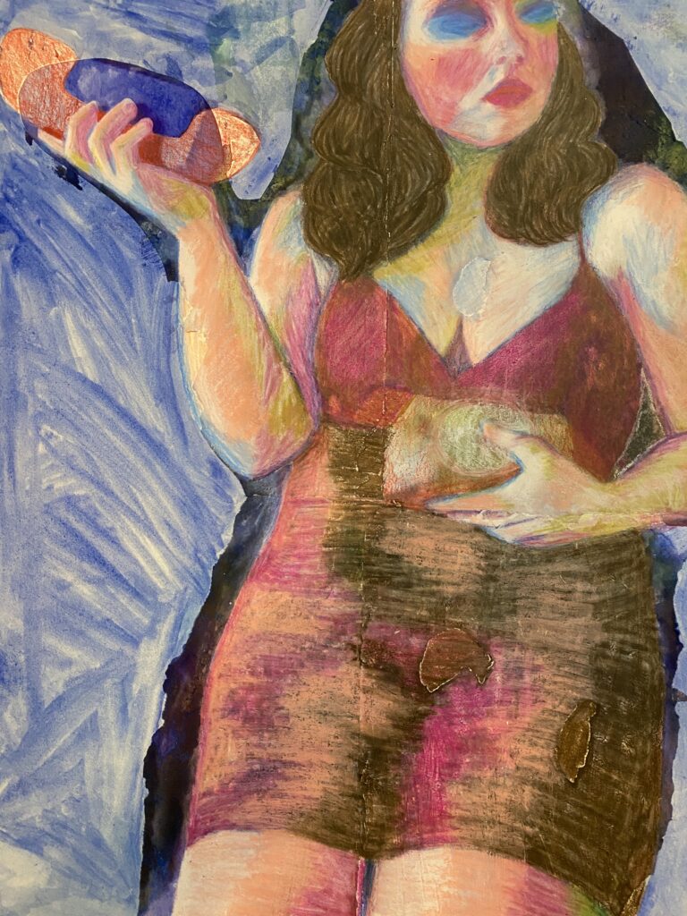
Anyway, I got bored of the other theme, I think because I was putting too much into the concept and not enough into the actual drawings. It was hard to make the actual drawings look interesting when the concept was so detailed and multi-level in my mind. So I started a new spin, inspired by my interest in wallpaper design recently. I’ve designed a few wallpapers this semester as a fun addition to other drawings, but I was mostly interested in the detail and the symbolism. So when I started my first of three final drawings, I used flowers and their Victorian meanings as an object of interest. I also just love portraits and I can put a lot of detail into the rendering of them, so I included that in the drawing as well.
Flower Language


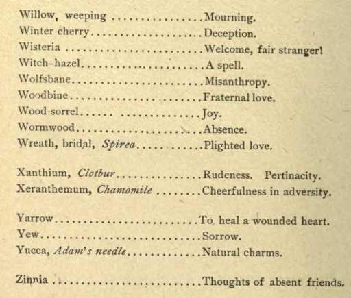

Communication Symbolism
The flowers/plants I used for my final are:
| Peppermint | Peace |
| Peony | Anger |
| Chamomile | Calm |
| Lily of the Valley | The return of happiness |
| Scarlet Geraniums | Silliness |
Not about the message but about the medium – just like the theme centres around not whats being said (sans the flowers) but how.
Non-verbal methods of communication:
- semaphore flags
- morse code
- telephone
- postcard
- messanger
- courier pigeon
- smoke signals
- flower language
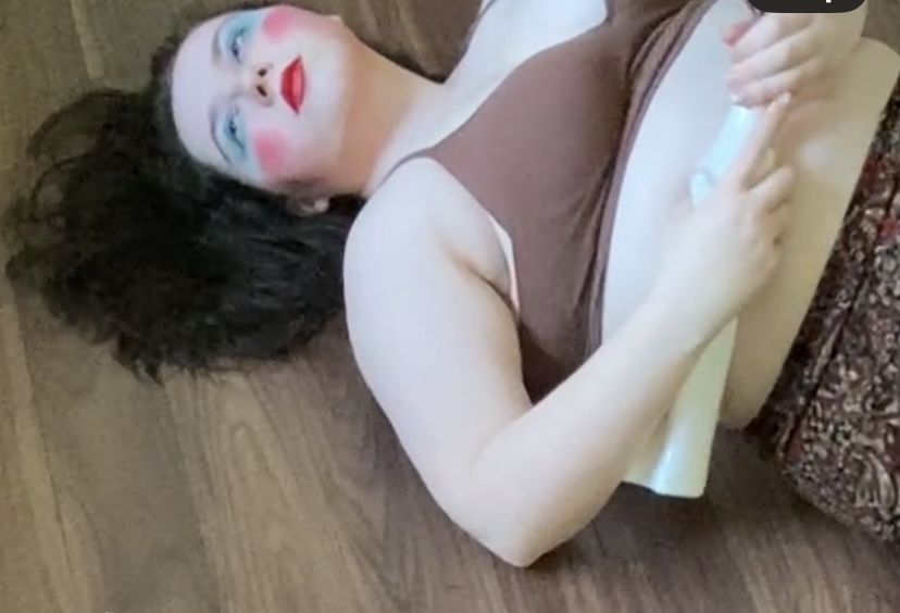
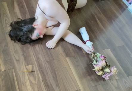
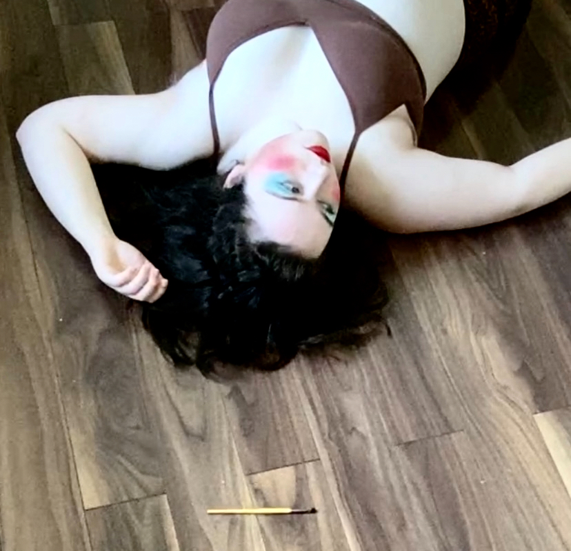
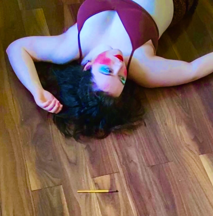
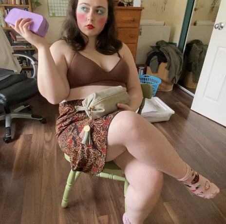
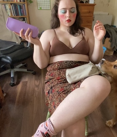
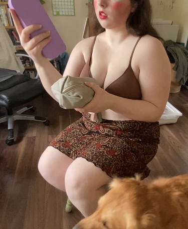
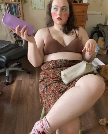
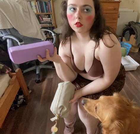
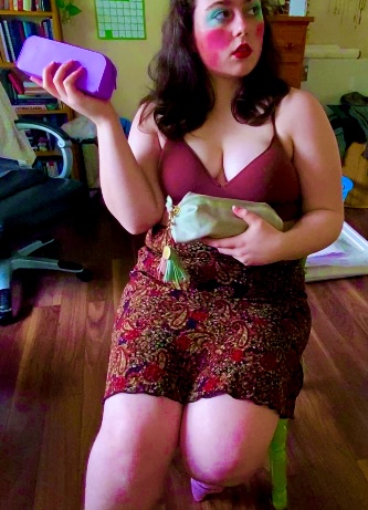
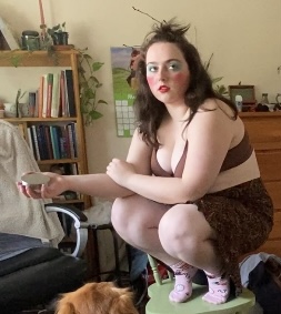
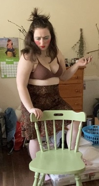
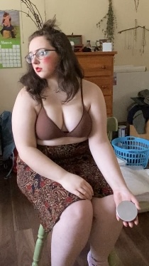
I couldn’t find any reference poses that were exactly what I had in mind, so I made them myself. I wore something simple but not nude so that I could have an easier time drawing the clothing and makeup on the figure later. I was thinking about colour and light as inspirations for this series, so I tried messing around a bit with some makeup in an exaggerated classic look (blue eyeshadow, red cheek, red lip). When editing, I was glad I did this because the colours really popped and made it a lot more fun.
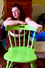
I wanted the focus to be on the figure so I chose a flooring with not a lot going on. Obviously this didn’t work for all the pictures I took, but since my hair is down in this one, I wanted to make sure I was against something plain so I could tell it apart. I set up a tripod for my phone to take pictures from. I actually did it as a video so that I could just do one long video with multiple poses and screenshot the poses I liked after. Unfortunately, I couldn’t see my screen from where I was posing, so the whole shoot was done pretty blind and I had no way of knowing if I was even in frame. Hence the… unorthodox angles and cropping.
I had two colour schemes that I was going to try, one where I did the most saturated but cool-toned edits possible, and one where I did more of a desaturated but highlighting the reds and browns more. It reminds me of merlot and 90s whimsical vibes, the colours that I imagine when I listen to The Cranberries. As much as I like the look, I thought I would have more fun and opportunity working with a brighter colour scheme, so I stuck with the high saturation edit.
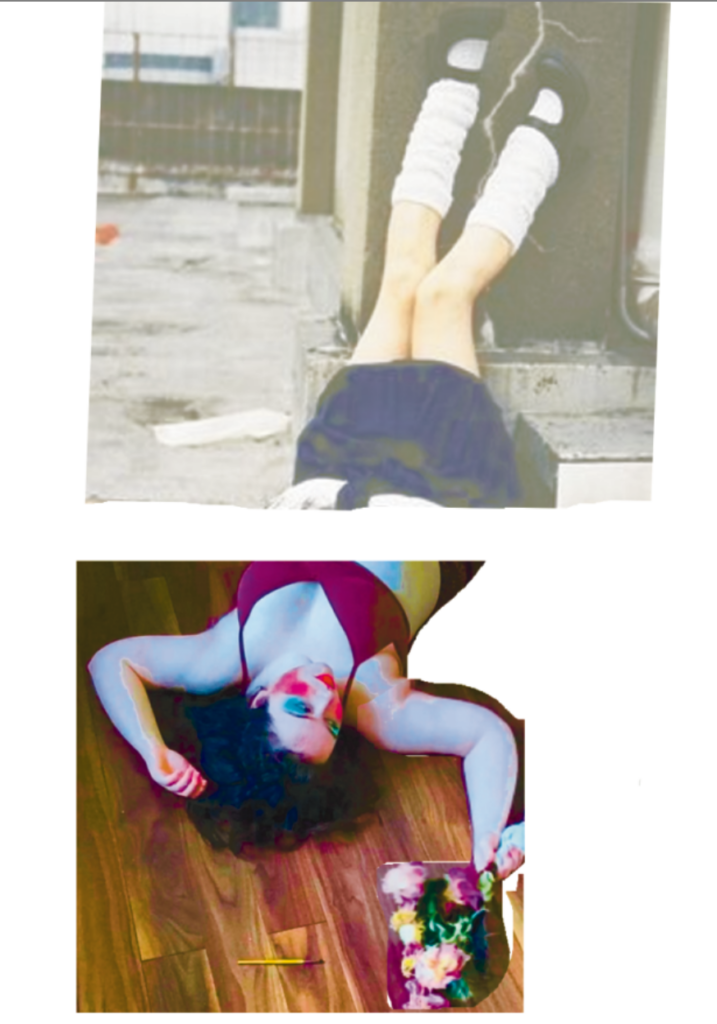


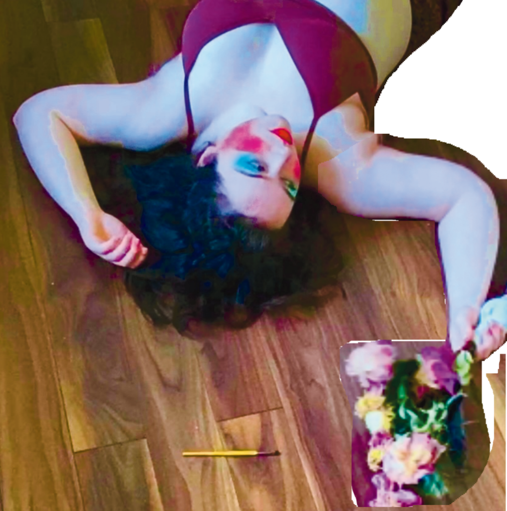


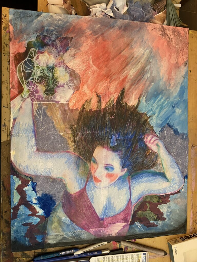
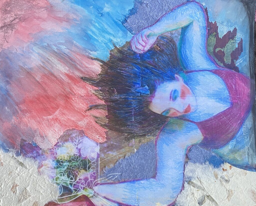
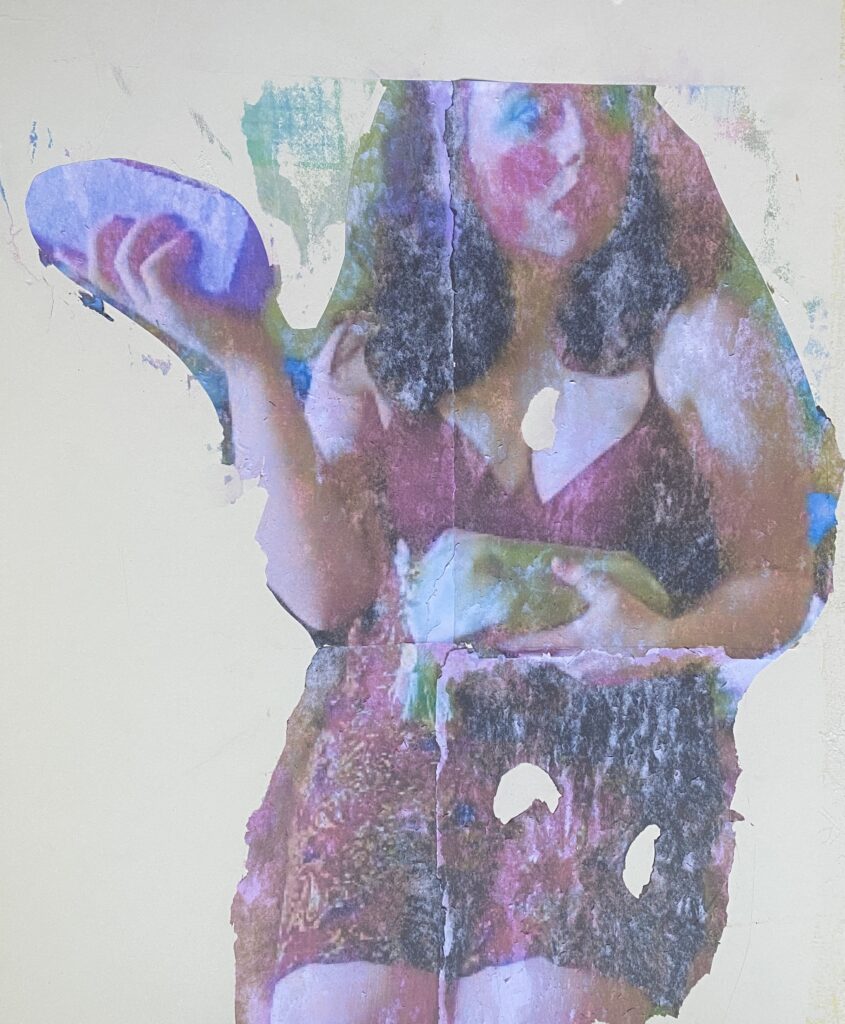
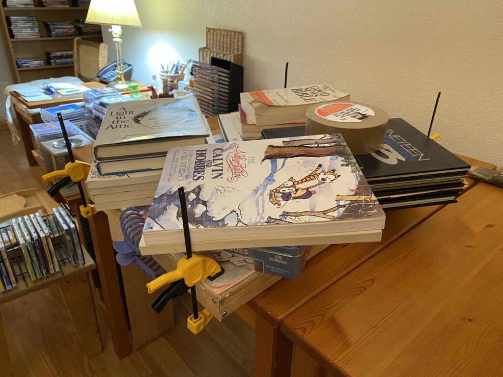
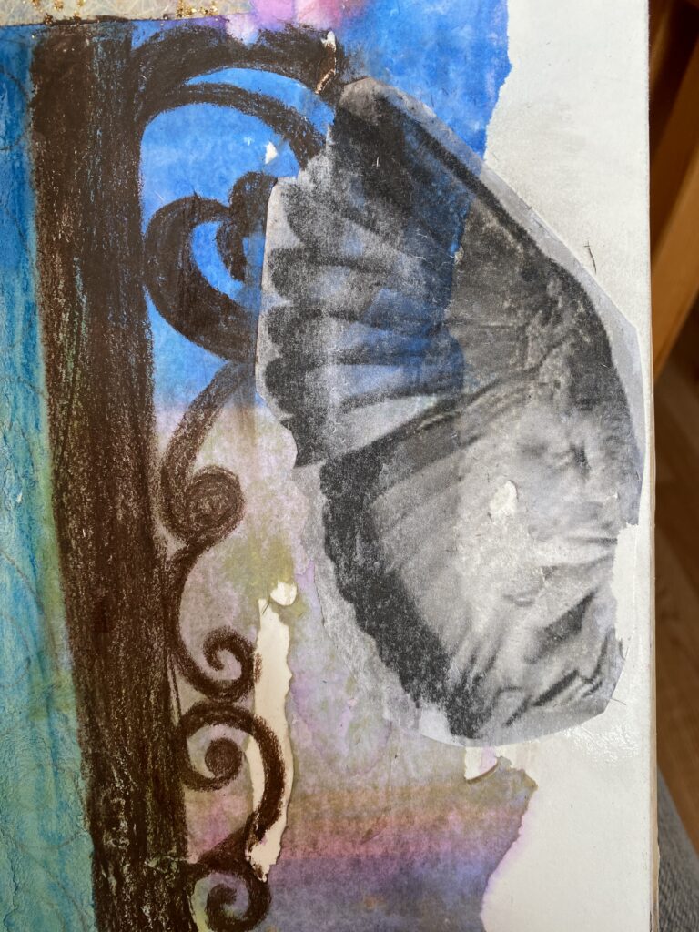
The transfer process for these was really fun. Basically I formatted a document in Word to have 0mm margins and put my image(flipped) across four pages. Then I printed the pages out on my home printer and used an acrylic medium to glue them to my board. Once the medium had dried, I took a damp sponge and gently wet the paper so that I could rub the top few layers of pulp off, leaving a cloudy image transferred. Now I had the exact proportions of the photograph, as well as a general placement for colour, light, and shadow.


.

.
.

.


.

.